
노마드 코더의 코코아톡 클론코딩 강의를 듣기 시작했다. 챌린지도 접수 완료!
챌린지 시작 전까지 예습하고, 테마라던가...? 생각해보면 좋을 것 같다.
참고 사이트는 w3school보다는 mdn을 사용해라
검색어 : html tags mdn
HTML : Markup(content) Language
CSS | 디자인과 스타일을 위한 언어
JavaScripte | 프로그래밍 언어. 웹사이트를 동적으로 만들어줌
list 리스트 태그 안에 따로 <li>로 만들어줘야 함
ol(ordered list) | 순서가 있는 리스트. type으로 목차 첫 머리의 스타일을 바꿀 수 있다.
ul(unordered list) | 순서가 없는 리스트
a | anchor(닻)
href | HTTP reference 혹은 hyperlink reference
attributes | 태그에 부가적인 정보를 주는 것
target="_blank" | 다른 창으로 링크를 열게 해줌
//target이 self일 때 해당 창에서 열고, blank면 새로운 창에서 연다
<a href="이동할 주소" target="_blank"> ~~~ </a>
self closing tag 따로 태그를 닫아줄 필요 없는 태그들
img | 이미지 삽입
meta | 구글 검색에서 보이는 description. 구글이 검색할 때 찾는 태그이기 때문에 중요하다.
link | 외부 리소스 연결 요소
<img src="이미지 주소" />
<meta name="description" content="This is my website." />
<link rel="shortcut icon" href="이미지 주소" /> //탭에서 보이는 아이콘
<meta property="og:image" content="이미지 주소" /> //og:image : 링크 공유를 했을 때 보이는 이미지
Form Tags
html에서 input의 유효성 검사(required, minlength 등)를 작동시키기 위해서는 해당 input이 form 안에 있어야 한다.
form tag 안에 자리하는 input의 type들(attribute)
file | 파일 첨부 accept=".png, .jpg" 식으로 어떤 파일들을 받을 수 있는지 정할 수 있다.
text | 텍스트 입력 칸
submit | 제출
url
email 등등...
attribute value
required | 칸이 비어있으면 입력해달라는 문구를 띄워줌
placeholder | 텍스트 상자 안에 이곳에는 무엇을 입력해야 할지 안내
min, maxlength | 최소, 최대길이 제한
label은 for이라는 attribute가 필요하고, input과 같이 써야 한다. for의 attribute value와 input의 id attribute value가 같아야 동작한다
<label for="profile">Profile photo</label>
<input id="profile" type="file" accept=".png, .pdf" />
semantic tags
<body>안에서 header나 main같은 경우, 예전에는 <div id="header">와 같이 작성했으나, 최근에는 아예 태그로 작성한다. div와 span같은 non-semantic(의미없는) 태그보다는 의미있게 작성
nico쌤이 자주 사용하는 tag들 : header main footer navigation sidebar/aside
<body>
<header>
<h1>The nico Times</h1>
</header>
<main>
<p>hello!</p>
</main>
<footer>© 2020 N.C</footer> //footer는 꼬릿말
</body>
css의 display를 통해 inline, block을 바꿀 수 있다.
inline은 위, 아래에 margin을 가질 수 없다. 위, 아래에 margin을 가지게 하려면 block 속성으로 바꿔야 함. padding은 사방으로 가질 수 있음.
그리고! 두 기능을 합쳐놓은 것 같은 inline-block도 있음. inline처럼 다른 엘리먼트들과 나란히 있을 수 있고, block처럼 margin이나 padding 조절이 가능함. 하지만 별로임... 중간에 빈 공간이 생기기 때문에. 반응형 디자인을 지원하지 않음!
box | 높이와 너비를 가짐. padding(border 안), border, margin(border 밖)를 가짐
collapsing margins | 두 tag의 상하 경계가 같을 때 발생하며 하나가 되는 현상. 이 현상을 해결하기 위해 padding을 활용
픽셀 값을 하나만->사방에 적용, 두 개->상하, 좌우 네 개->시계 방향으로 상 우 하 좌
태그가 같은데(ex. div) 각 박스마다 다른 색을 지정하고 싶다면 id를 이용하자
id는 # class는 . *{}는 전체 스타일 적용
id말고 class를 사용할 때
<!DOCTYPE html>
<html lang="kr">
  <head>
    <title>Home - My first website.</title>
    <link rel="stylesheet" href="style.css" /> //css를 html이 아니라 다른 문서로 작성할 때
    <style> //html파일 내부에 css를 작성할 때
      body {
        margin: 20px;
      }
      .btn {
        color: aliceblue;
        padding: 5px 10px;
        border-radius: 5px; //모서리 둥긂 정도
      }
      .aqua {
        background-color: aquamarine;
      }
      .tomato {
        background-color: tomato;
      }
    </style>
  </head>
  <body>
    <span class="btn aqua">Hello</span>
    <span class="btn tomato">Hello</span>
    <span class="btn aqua">Hello</span>
    <span class="btn tomato">Hello</span>
    <span class="btn aqua">Hello</span>
    <span class="btn tomato">Hello</span>
    <span class="btn aqua">Hello</span>
  </body>
</html>
flexbox. 세개의 규칙이 있다.
-child element에는 아무것도 적지 말아야 함. parent element에 적어야 함. div를 움직이게 하려면 div를 감싸고 있는 body(다른 tag라면 그 tag에 맞춰서) 스타일에 display: flex; 로
-main axis(주축) | justify-content: ; 로 입력. 기본값은 수평이다. (수직으로 바꿀 수 있음)
-cross axis(교차축) | align-items: ; 로 입력. 기본값은 수직이다. (주축이 바뀌면 따라서 바뀌는듯)
flex-direction | 주축을 row로 할지 column으로 할지 설정할 수 있다.
<!DOCTYPE html>
<html lang="kr">
  <head>
    <title>Home - My first website.</title>
    <link rel="stylesheet" href="style.css" />
    <style>
      body {
        margin: 20px;
        height: 100vh; //px 말고 vh는 view height 스크린 크기라고 생각하면 된다. body의 height를 정해줘야 함.
        display: flex; //main, cross axis를 사용하려면 display를 flex로 바꿔줘야 함.
        flex-direction: column; //주축을 수평이 아니라 수직으로. row는 수직
        justify-content: space-between; //여백을 자동으로 나눠서 배치한다
        align-items: center; //flex-direction이 column이니 여기서는 수평.
      }
      div {
        width: 50px;
        height: 50px;
        display: flex; //div 안에 텍스트를 입력하면, div가 그 텍스트들의 부모가 되므로 flexbox 사용 가능
        justify-content: center;
        align-items: center;
        background-color: teal;
      }
    </style>
  </head>
  <body>
    <div>1</div>
    <div>2</div>
    <div>3</div>
  </body>
</html>
position 속성들. 해당 속성들을 사용하려면 width 값을 꼭 지정해 줘야 한다.
fixed | 스크롤을 움직여도 해당 박스가 그 자리에 있음
relative | element가 처음 위치한 곳을 기준으로 수정
absolute | position이 reletive인 태그를 기준으로 움직임. reletive 속성이 있는 parent가 없다면 body를 기준으로 움직인다.
<style>
  body {
    margin: 100px;
    height: 100vh;
  }
  div {
    width: 300px;
    height: 300px;
    background-color: antiquewhite;
  }
  #different {
    width: 100px;
    height: 100px;
    background-color: aqua;
    position: relative;
    top: -10px;
    left: -10px;
  }
</style>
</head>
<body>
<div>
  <div id="different"></div>
</div>
</body>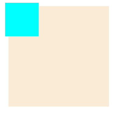
pseudo selector | class나 id대신 div:nth-child(n){} 처럼 수많은 div 중 한두개만 바꿀 때
n대신 even은 짝수, odd는 홀수 2n+1, 3n+1등등 자유자재로 바꿀 수 있다
<style>
    body {
      height: 100vh;
      margin: 50px;
    }
    input {
      border: 1px solid wheat;
    }
    input:required {
      border-color: blueviolet;
    }
    input[type="password"] {
      background-color: thistle;
    }
    input[placeholder~="name"] { //placeholder에 name이 들어가는 것들 전체에 css적용. attribute를 사용한 예시
      background-color: pink;
    }
  </style>
</head>
<body>
  <div>
    <input type="text" placeholder="First name" />
    <input type="text" placeholder="Last name" />
    <input type="password" required placeholder="password" />
  </div>
</body>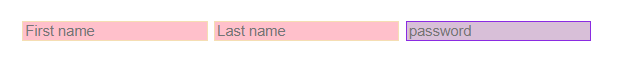
Combinatiors. span마다 따로 스타일을 적용하고 싶을 때
div > span {} | 다이렉트 부모 > 자식
div span {} | 다이렉트가 아닌 부모 자식
p + span {} | 다이렉트 형제 + 형제
p ~ span {} | 다이렉트 아니어도 됨
  <style>
    body {
      height: 100vh;
      margin: 50px;
    }
    span { //span 공통
      color: rgb(146, 0, 61);
      background-color: antiquewhite;
      padding: 5px;
      border-radius: 10px;
    }
    p span {
      color: rgb(255, 71, 145);
    }
    p + span { //형제. p안의 span이 아니라 p 바로 다음에 오는 span. 중간에 다른 태그가 있으면 적용이 안되고, +가 아니라 ~로 바꿔야 한다.
      text-decoration: underline;
    }
  </style>
</head>
<body>
  <div>
    <p>
      대 화산파 13대 제자. 천하삼대검수(天下三代劍手).
      <span>매화검존(梅花劍尊) 청명(靑明)</span> 천하를 혼란에 빠뜨린
      고금제일마 천마(天魔)의 목을 치고 십만대산의 정상에서 영면. 백 년의
      시간을 뛰어넘어 아이의 몸으로 다시 살아나다.
    </p>
    <address></address> // <-이렇게 p와 span 사이에 태그가 추가되면 p ~ span으로 스타일을 바꿔야 함
    <span>화산귀환</span> //p+span 스타일이 적용되는 부분. p태그 위로 올리면 p+span 스타일은 적용이 안된다.
  </div>
</body>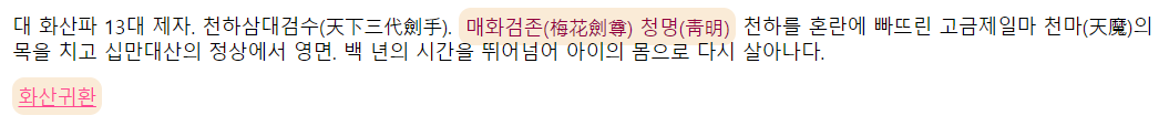
States. 개발자 도구에서 확인할 수 있는 강력한 Selector들
active | 버튼을 누르고 있을 때
hover | 마우스를 올려놨을 때
focus | 키보드로 선택됐을 때
visited | 링크에만 적용됨. 클릭하거나 방문한 적이 있는 링크는 visited로 바뀌고, 그때 지정된 스타일이 적용됨
focus-within | focus 상태인 자식을 가진 부모 엘리먼트에 적용
input:active { //input대신 button과 같은 다른 것도 올 수 있다
  background-color: aqua;
}

//부모인 form이 hover 됐을 때, 자식인 input들의 배경색을 아쿠아로.
//input:focus로 변경하면 form이 hover 되고, input을 focus 했을 때 스타일이 적용된다.
form:hover input {
  background-color: aqua;
}
컬러 시스템
16진수 컬러 | #FFCCE00
rgb | rgb(252,206,0)
rgba | rgb에 투명도 rgba(252, 206, 0, 0.4)
root는 기본적으로 모든 document의 뿌리
변수(원래 명칭은 custom property) 이름은 --이름-이름 으로 지정한다. (--default-border 와 같이)
변수를 사용할 때는 var(--main-color) 혹은 var(--color)
:root {
  --main-color: 색깔;
  --default-border: 1px solid var(--main-color);
}
Transition | 어떤 상태에서 다른 상태로 변화하는 것. 애니메이션이 아님. state에 따라 바뀌는 property를 갖고 있으면 사용되며 state가 없는 쪽에 쓰여야 한다. (state : active, hover, focus…)
ease-in function | 브라우저에게 애니메이션이 어떻게 변할 건지 알려줌
linear | 같은 속도로 움직임
ease-in | 처음에 조금 더 빠르게 움직임
ease-out | 끝에서 느려짐
ease-in-out | 처음과 끝은 느리지만 중간에 가속
cubic-bezier | 사용자가 직접 애니메이션을 만들어서 적용
Ceaser 에서 cubic-bezier 설정들 볼 수 있음
<style>
  a {
    color: wheat;
    background-color: tomato;
    text-decoration: none;
    padding: 3px 5px;
    border-radius: 10px;
    font-size: 55px;
    transition: background-color 10s ease-in-out, color 5s ease-in-out;
    // transition: all 5s ease-in-out; <-일반적으로는 all을 사용하지만, 차이를 주고 싶을 때는 각각 설정한다.
  }
  a:hover {
    color: tomato;
    background-color: wheat;
  }
</style>
Transformation | 원하는 요소를 이동시키기 위해 사용한다. (클립스튜디오의 변형과 자유 변형의 중간 정도로 생각하면 될 듯...? 자유 변형은 9분할이지만 이건 따로 분할이 없는듯하다...) 일종의 3D transformation이기 때문에 margin, padding이 적용되지 않음. box element를 변형시키지 않는다.
Transform MDN 에서 설정들 볼 수 있음
img {
  border: 10px solid black;
  border-radius: 50%;
  transition: transform 5s ease-in-out;
}
img:hover {
  transform: rotateZ(90deg);
}
Animation | 계속되는 transition 혹은 transformation을 갖고 싶을 때 @keyframes 애니메이션이름 {} 으로 작성
Animista 에서 다양한 에니메이션들 볼 수 있음
<style>
  @keyframes coinFlip {
    from {
      transform: rotateY(0);
    }
    to { //이 경우, rotate하면서 이미지가 100px이동 후, 애니메이션이 끝나면 다시 원점으로 돌아오기 때문에 예쁘지가 않다.
      transform: rotateY(180deg) translateX(100px);
    }
  }
  img {
    border: 10px solid black;
    border-radius: 50%;
    animation: coinFlip 5s ease-in-out infinite;
  }
</style>
@keyframes를 0~100% 사이로 지정해서 애니메이션을 조절할 수 있다. 위 코드의 애니메이션이 끝나면 붕 떠서 원위치로 오는 현상 해결
<style>
  body { //이미지를 중앙에
    display: flex;
    height: 100vh;
    align-items: center;
    justify-content: center;
  }
  @keyframes coinFlip {
    0% {
      transform: rotateY(0);
    }
    50% {
      transform: rotateY(180deg) translateX(100px);
      opacity: 0; //투명도
    }
    100% {
      transform: rotateY(100px);
    }
  }
  img {
    border: 10px solid black;
    border-radius: 50%;
    width: 200px;
    animation: coinFlip 5s ease-in-out infinite;
  }
</style>
시간차 애니메이션 | 각각 딜레이 시간이 다른 버튼 4개의 transform을 keyframes에 주면, 딜레이 된 후 애니메이션을 인식하기 때문에 예시1과 같은 상황이 발생한다. 따라서 transform을 애니메이션이 있는 엘리먼트에 주면 예시2와 같은 애니메이션을 만들 수 있다.
@keyframes appearBtnAnimation {
  from {
    opacity: 0;
  }
  to {
    transform: none;
    opacity: 1;
  }
}

.nav_btn {
  opacity: 0;
  transform: translateY(50px);
  // 애니메이션의 마지막 상태를 기억하고 싶다면, forwards를 추가해 준다.
  animation: appearBtnAnimation 1s ease-in-out forwards;
}

.nav_btn:nth-child(2) {
  animation-delay: 0.5s;
}

.nav_btn:nth-child(3) {
  animation-delay: 1s;
}

.nav_btn:last-child {
  animation-delay: 1.5s;
}
will-change | 애니메이션의 기능을 어색하지 않게 만들어 주는 기능. 브라우저에 어떤 것이 변할 것인지 미리 예고를 해준다. 그래픽카드를 이용해서 애니메이션을 가속화시키며 모든 애니메이션에 사용한다면 기능이 저하될 우려가 있으니, 흔들리거나 버벅거리는 애니메이션에만 사용하는 게 좋다.
.open-post__heart-count:hover i {
  will-change: transform;
  animation: heartBeat 1s linear infinite;
}
Media query | 반응형 웹사이트를 만들 수 있게 하는 기능. 조건을 추가할 때는 and를 이용한다.
media query에 (orientation: landscape(가로모드) or portrait(세로모드)) 속성도 넣을 수 있다
  <style>
    body {
      display: flex;
      height: 100vh;
      align-items: center;
      justify-content: center;
      flex-direction: column;
    }
    div { //기존 div 박스의 색상은 teal
      background-color: teal;
      width: 200px;
      height: 200px;
    }
    // 화면 크기가 650px~800px 사이에서는 tomato 색상으로 보이게
    @media screen and (min-width: 650px) and (max-width: 800px) {
      div {
        background-color: tomato;
      }
    }
    span {
      font-size: 36px;
    }
    // 스크린이 가로모드가 되면 span을 안 보여주게
    @media screen and (orientation: landscape) {
      span {
        display: none;
      }
    }
  </style>
</head>
<body>
  <div></div>
  <span>Please flip your phone :(</span>
</body>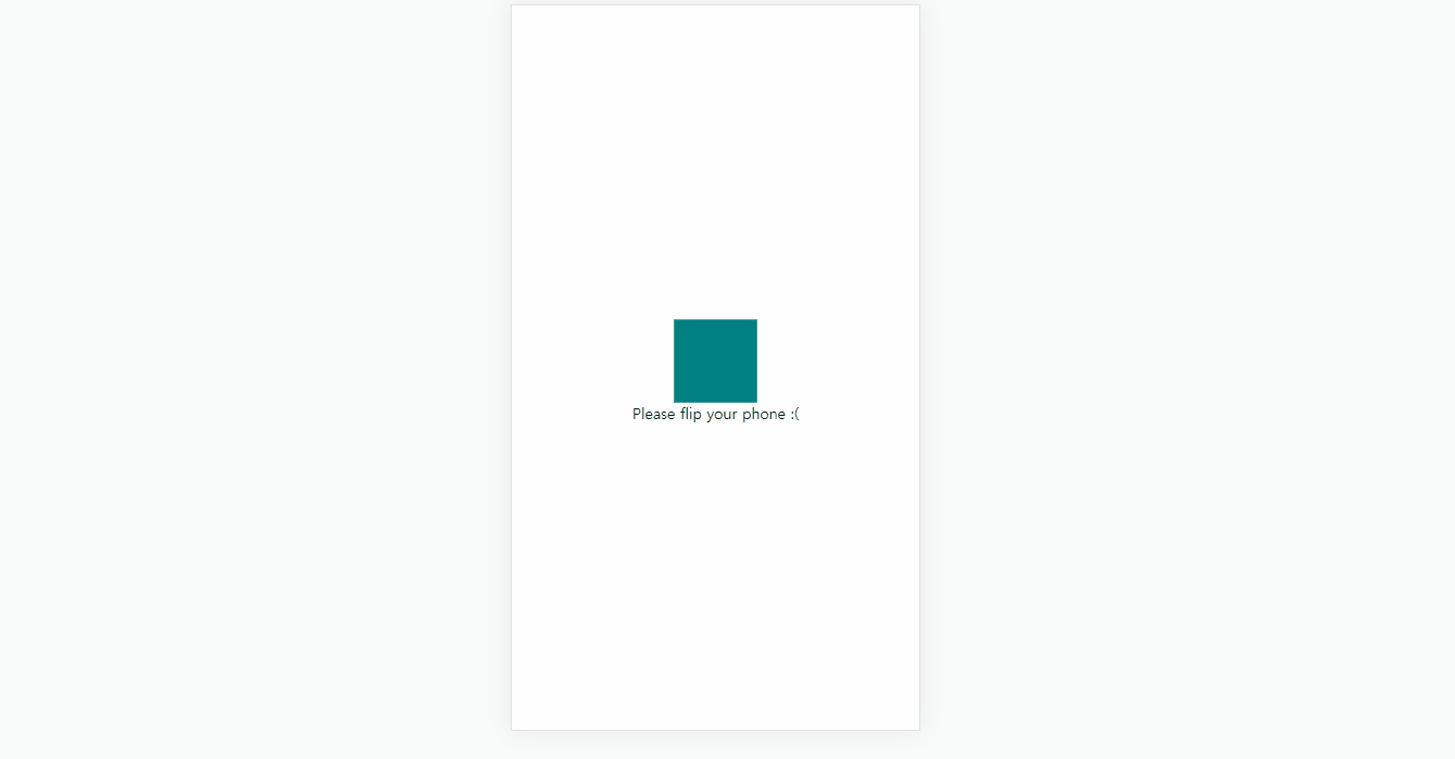
.gitignore | 무시하고 싶은 파일 이름을 기록하는 파일
BEM(block element modifier) | id가 아닌 class만을 이용하는 방식. 소스코드들을 더 쉽게 알아볼 수 있지만, class 사용이 많아지다 보니 class가 무거워질 수 있고, 해당 방식을 모르거나 싫어하는 사람이 있을 수도 있다.
<a class="btn btn--big btn--orange" href="#">
    <span class="btn__price">$9.99</span>
    <span class="btn__text">Subscribe</span>
</a>
html의 form은 2가지 속성(attribute)을 가지고 있다. action과 method
action | 어떤 페이지로 data를 보낼 것인지 지정할 수 있음
method | post와 get 두 가지 방법으로 데이터를 보낼 수 있다.
-post는 백엔드 서버에 정보를 전송하는 방식. username, password와 같이 보안이 중요한 정보들을 보낼 때 사용한다. 서버가 따로 없으면 post로 지정해도 자동으로 get 방식으로 데이터를 보냄
-get은 보안에 취약하다. url에 포함되어도 상관없는 정보를 보낼 때 사용한다.
box-sizing: border-box;
Border Box가 width 200px 일 때, padding-left: 50px;을 주면 css는 content 부분을 유지하려고 해서 width는 기존 200px + padding-left 50px = 250px가 되어버린다.
box-sizing: border-box; 은 padding이 추가될 때 content 부분을 유지하지 말고 기존 width 길이를 유지할 때 이용 (width는 200px, content는 150px로 감소)
z-index | layer 같은 것. 겹쳐지는 박스들 중 어떤 것을 제일 위로 보여줄지 선택할 수 있다. 값이 높을수록 제일 위의 레이어에 오는 것.
'html, css, JavaScript' 카테고리의 다른 글
| 자바스크립트 함수 유형 정리 (0) | 2022.11.03 |
|---|---|
| addEventListener 종류 (0) | 2022.10.03 |
| 코딩온 사전 온라인 교육 컨텐츠 정리 (0) | 2022.09.26 |
| 노마드 코더 바닐라 JS로 크롬 앱 만들기 강의 정리 (+Windows 셋업 강의) (0) | 2022.08.12 |
| 유튜브 생활코딩 강의 정리 (html, css, JavaScript) (0) | 2022.08.12 |